
Adobe AIR : Feel the Air
 Learn how to build rich internet applications based on Adobe Integrated Runtime platform, and deliver them across most operating systems.
The Adobe Integrated Runtime (Air), is a cross platform runtime. Basically, it’s a wrapper for rich internet applications to be installed on several operating systems. It’s freely available, and you can download it from the Adobe web site just like the Flash Player. You will get rich and engaging visuals from the applications you create for Adobe Air as it includes a lot of built-in graphic capabilities. Also the applications will run on Windows, Linux and Mac machines with little or no code modification on your part. Finally, your users will also enjoy a quick and simple installation through Adobe Air runtime.
You can build Air applications using HTML and JavaScript which are then rendered inside an Air application using the open source web-kit HTML and JavaScript engine. So, you can use a HTML editor such as Dreamweaver or Notepad to create Air applications. You can also build Air applications using the Adobe Flex Builder, which is exactly what we will do in this article. While Flex is traditionally used to build Flex applications for the browser, the Air SDK that has been added into Flex recently gives you more features that are specific to Adobe Air.
Air vs. Flash
Air and Flash are both Virtual machines (commonly referred to as ActionScript virtual machine) like Java, but Air adds more access to the underlying operating system when compared to Flash, so developers can interact with the operating system’s dock, or start menu or taskbar in addition to files, network connections and more. Unlike Flash applications, Air applications are packaged into installers and run like other ‘traditional applications’ without the need of a web browser.
Getting started
We will create a simple desktop application for Adobe Air using the Adobe Flex Builder IDE which will use Air user interface controls and validation. Along the way, we will delve into Action Script 3, one of the programming languages you can use for creating Air applications with Flex Builder and some advanced Air functionality.
 The Flex Builder user interface
Prerequisites
You’ll need to install Adobe Flex builder available at http://www.adobe.com/ products/flex/ and on this month’s DVD
Building blocks
Start by creating your first Flex Builder project for Air and also get familiar with the user interface. Type in the project name, and make sure you select ‘Desktop Application (runs in Adobe Air)’ in the Application Type.
 To create a new project, click on File > New > Flex Project
Click on Finish to generate your project. It will open in the source view. In the top pane, click on Design button to switch to Design view.
 Setting parameters in your AIR project is easy
Let’s break down the Flex Builder Interface and go over one pane at a time. In the upper left, you will see the Flex Navigator pane. It will contain all your projects in a folder tree type view. The source folder contains the MXML file that was generated when we created our project. The XML file in the same folder contains details about how the application runs in Adobe Air like the initial window size and how the window looks. The bin-debug folder is where your application will be compiled to when you debug or test it.
Below the Flex Navigator pane, is the Outline and Components pane that contains the visual controls that you can use in Flex and Air applications. To add these controls to your application, you can simply click and drag them out onto the design area of your application. The layout button contains different visual controls that will organize visual components of your application. The charts folder contains components that facilitate display of data in a visual way using charts.
On the right hand side of the window, there is the states pane that is used to define the different view states for your application and to add and remove components many at a time. Below this is the Flex properties pane that shows the editable properties of whatever is selected in the Design pane. The bottom pane is the Problems pane. This pane will display the details and the line numbers of the problems that may come up in your application. This will be used pretty frequently while debugging.
 Using the properties pane on the right, give the horizontal slider an ID (temp) and give it a minimum value of say 200 and a maximum value of 600
Adding user interface controls
Let’s begin by dragging the Labels control by dragging it from the Components pane and dropping it onto your application in the Design view. The text entry box for this component can be accessed in the properties pane when this control is selected. You can also choose different fonts and styles for your text in the same pane.
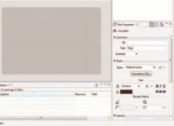 Label Control and its properties
One of the most commonly used controls and one of the simplest is the Button control. Drag it and add it on the Design stage. In the Flex Properties pane, you will see that the button has an ID, Label and some options regarding where the label is placed and what happens when the button is clicked. Like the other MXML controls, you can set various style properties also.
The image control lets you specify a source for your image and then display it in your application. It’s very similar to the HTML image tag. The RichTextEditor control will enable users to enter text and also style it by changing the font or color. The Text Input control is a single line text input control, and will be used very frequently in most applications.
The checkbox control is used when you want people to select either a Boolean type Yes or No or if you want them to select multiple items from a group of checkboxes. If you drag one of those onto the stage, you will that the checkbox control consists of the box itself and a label. The Radio Button control is similar to the checkbox control. The Radio Button Group control lets you group different radio buttons together and associate them with another enabling functionality similar to the HTML Radio buttons, i.e., only one radio button among a group can be selected.
 Properties and layout of Radiobuttons and Checkboxes
Combo Box control also has the same Data Provider property. When you drag it out onto the stage, it doesn’t have any items. As you can see, it is your standard drop down box, the choices of which are populated by the data provider of the control. You can set it by using a Binding expression or by giving an array of values. In the properties pane, go the Data provider text box and add the options you want to have within square checkboxes and separated by commas as follows: Windows, Mac, Linux, Other. The Combo Box will then get populated by the values we specified.
The Data Grid control is a table like view with columns and rows and also has the Data Provider property. It is very useful in database applications, or applications which have a large list of objects which you need to present to the user.
There is a Date Chooser control which displays a small calendar and allows the user to select a data from it. A similar control is the Date Field control, which has a calendar button next to a text box for the user to click and choose a date.
 The calendar for DateChooser control
One really interesting control is the Video Display control that can be used to show a video within your application. You can even stream media from a compatible server. However, the video needs to be strictly an FLV file.
Different layout controls can be used to align your Component controls, add spaces and make your application look visually appealing.
Source view
When you switch to the source view of the application, you see the source code in MXML language of your application. You can even enter your Action Script code here. For this, you use the CDATA tag as follows:
<mx:Script>
<![CDATA[
]]>
</mx:Script>
 Click on the Green run button to test your application.
Data Binding in MXML
Simply put, data binding in MXML is tying a value of one control to the value of another control. To begin, let’s delete all the existing controls on our application. The first thing we want to do for our application is to change the layout of our application from absolute to vertical. To do this, navigate to source view and change the property in layout from absolute to vertical.
Next, let’s switch to the design view and add the necessary components. First add the Image control to our application. Next add an HSlider control underneath it.
 Navigate to an image and click on Ok
Also enable live dragging by choosing True in the dropdown box corresponding to the Live Dragging label.
Then select the Image control on the stage and switch to source view. What we will do now is bind the Image size of this to the value of the slider control. To do that, just change the width attribute of the Image control to {temp.value}. Curly braces are used in MXML to encapsulate the control you are binding to and its property. The temp is the ID of our slider and the property we want to access is its value in our case.
Next we will add a Browse button on our application. To do this, drag an Application Control Bar control from the Layout folder onto your application. In the Properties pane, select Dock to be True. Next add a button control on the Application- Control Bar by dragging it onto the stage.
Finally, we want to be able to browse to an image file in our file system using the browse button you just created. To do this, we will add some Action script code to the MXML source:
<mx:Script>
<![CDATA[
private
var file:File;
private function
click(evt:MouseEvent):void {
file
= new File();
file.
addEventListener(Event.
SELECT, file_select);
file.
browseForOpen(“Select an Image”);
}
private function
file_select(evt:Event):void {
img.
source = File(evt.currentTarget).
nativePath;
}
]]>
</mx:Script>
Deploying your application
Once you have created your Air application, you have to package your application into an AIR file. You can do this by going to Project > Export Release Build. You have to choose the project and then the main application file. You can choose to include or exclude your source files if you want. You have to then sign the Air application before it can be exported. You can either create your own certificate or get it from companies such as VeriSign.
 Now as you move the slider from left to right, you will notice that the image size will change alongside our action. Because we have enabled live dragging, the image size changes dynamically
Next click on the Finish button to output the AIR file at a location you chose. You can then install and run your application by double-clicking on the AIR file.


 TechQuark is a mobile-friendly website. Simply bookmark