Make your own font !
Have you ever wanted to make text appear just like your own handwriting, but never found a font that could do the trick? Is a little personalization all you need to complete that card you just designed, but all the handwriting fonts seemed too common to use? Here’s how to get your own handwriting font using Font Capture.
 First, head on to the web site (www.fontcapture.com), click on “Create your font now” and download the font template available as a PDF file. Print this sheet and write on it with your handwriting as directed and then scan the sheet (use 200 dpi or higher). Save it as a JPEG or PNG file and upload it on the web site. Name the font to identify it. You can then download your own font!
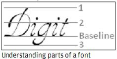
The quality of the font depends upon how you fill the template sheet, so we should keep a few things in mind. In any piece of text (say “Digit”), the baseline is the imaginary line on which all
 the letters sit. The uppercase letters fit between baseline and (1) – which gives us the cap height, whereas most of the lowercase letters are between baseline and (2) – which gives us the x-height. A few characters have ascender and / or descender (like ‘d’ and ‘g’ respectively), which may cross the x-height.
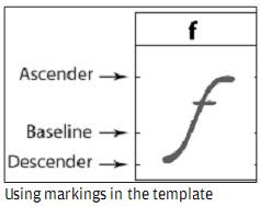
The template has small guide marks to roughly giving you an idea about how high the ascender can reach, the baseline, and how low the descender can reach. Try and keep the letters inside the top and bottom lines to prevent them from being cut off.
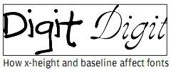 What makes a font look different from another is how the x-height and cap height are varied. As evident in the above example, the non-uniform baseline and varied x-height makes the font look more like rough handwriting, whereas uniform baseline and nearly similar ascenders and x-height will give the font a smooth, pleasant feel. Also, for making your font legible, use a black marker / gel pen and avoid using very thin strokes throughout the font, though a few elegant fonts do have varying the stroke thickness.
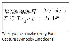
After a few tries, you’ll be able to get a font that nearly looks like something you’ve written on paper. But that isn’t all you do with FontCapture. It can represent alphabets using anything that you fill in the template sheet, which means you can creatively use a few characters that you don’t use often to represent some special symbols. In fact, you can use your own symbols to represent letters and send across coded messages!
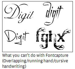 One of the main limitations of FontCapture is the lack of space: you can’t add fancy frills to a character because the template has a small fixed space for each one of them. Getting a running handwriting font takes a while to master, for which you must start and end the characters at same height. Also, you can’t have overlapping characters or even simple cursive characters which might extend into another character’s area, which doesn’t leave much room for creativity. But you can still come up with many interesting fonts. Possibilities are endless!


 TechQuark is a mobile-friendly website. Simply bookmark